

1,300 clients later, here’s what I know works:
Email.
Whenever I (or my clients) need a little more money email always delivers.
A survey by eConsultancy revealed that most legit marketers still consider email to be their strongest performing channel for driving sales (no surprise).
Another report in Monetate’s eCommerce Quarterly showed that email converts better than search, social or organic.
The simple, honest truth: if you want to put real dollars into your pocket, then start using email better.
These 9 tactics you’re about to discover for putting more subs into your email list have been proven to work. Apply them diligently and you will increase your subscriber count by a few hundred percent at least.
Let’s start with #1:
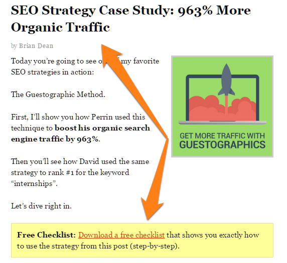
#1. Create a Contextual Content Offer
If you’re a conventional marketer, you likely have a little opt-in box at the bottom of all your posts.
And like most marketers, your readers are likely ignoring this opt-in completely.
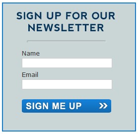
What Most Opt-ins Look Like (Blah…)
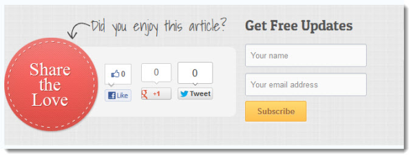
Oh no! Anything but the “Share the Love” 80’s Reference…
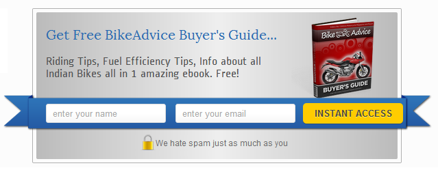
Why God, wwhhhhyyyy? A “buyers guide” opt-in in 2015? Do you have no mercy for us underlings oh Lord?
It’s not that your readers don’t like free stuff. It’s just that they don’t have any real motivation or context to download your free report.
Let’s say you put up a post about getting more traffic from social media. Your readers liked it. They even shared it with their friends.
Then they scrolled to the bottom of the page and found an opt-in for a free report on mastering SEO.
Can you see what’s wrong here?
Your content offer lacks context. You use the same download for all posts, regardless of their content.
Like this.
The download is about SEO when the original post is about social media. There is no contextual relevance between the post and the opt-in bribe.
But there is a solution.
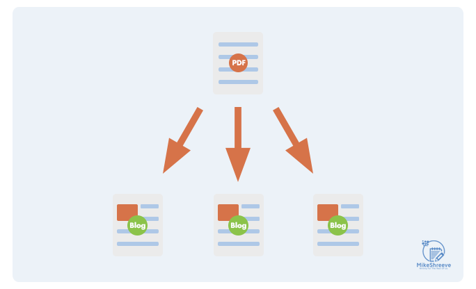
It’s called Content Upgrades (aka: Ascension Marketing).
Here’s how it works:
Step #1. Create blog posts as you normally would.
Step #2. Make a short downloadable document related to the post that helps your visitor PUT INTO ACTION what you just taught them in your blog post. Help them upgrade from reading to DOING.
Step #3. Lock this content behind an opt-in firewall or use one of these.
This way, instead of a single generic download for all posts, you have specialized content offers for each post.

You snag readers with the content of your blog, then you ascend them through your funnel through a natural contextual connection. It’s like walking up the rungs of a ladder.
Only more awesomer because you make money.
Lots of bloggers are already doing it successfully. Here’s an example from Backlinko:
And here’s an example from OkDork:
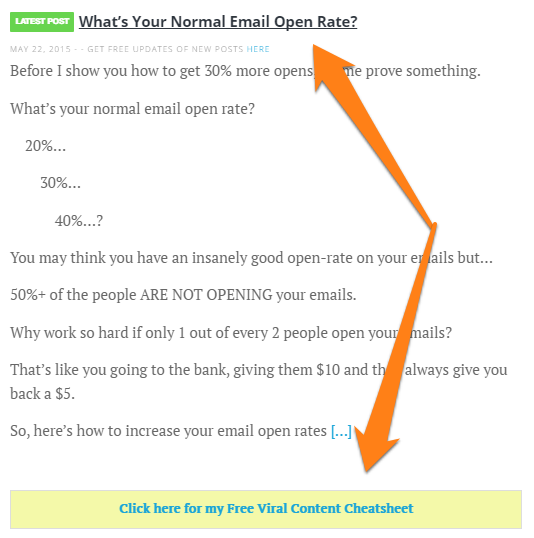
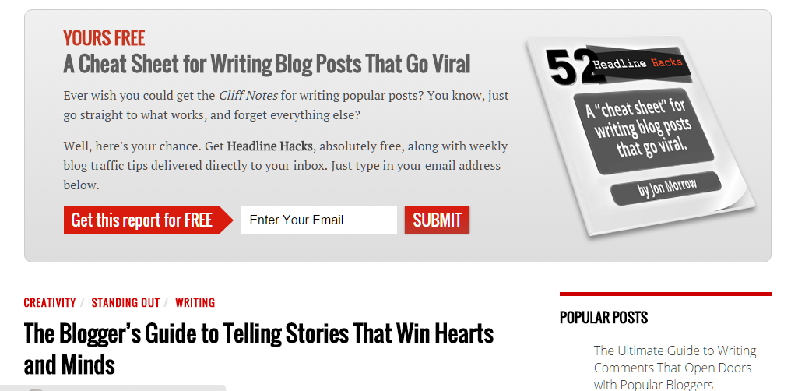
And here’s an example from me:
The Ultimate Subject Line Swipe File
Steal The Subject Lines That Doubled My Revenue In Just 3.25 Weeks
Content upgrades work for two reasons:
- Contextual Relevance: The content upgrade is directly related to the blog post, and hence, contextually relevant.
- Reader Buy-in: Since the reader has already invested effort into reading the post, he is more likely to download a content offer that is tied to the post.
I know this requires extra effort, but the results are well worth it. You will see a sharp uptick in the number of opt-ins per post. With a high quality, relevant upgrade, you can see conversion rates as high as 30%+.
The following content types work best for content upgrades:
- Checklists: Checklists condense the content into a short, actionable list. Use them on long blog posts (3k words and over).
- List of tools: For case studies and how-to’s, consider using a list of tools used as the content upgrade. This is also a good way to make some affiliate commissions.
- Supplemental content: For listicles, consider supplementing the base post with additional content. For example, you could offer a list of 10 things, but keep one item from the list in the content upgrade.
- Visual content: Video walkthroughs, infographics, Slideshare presentations, etc. that summarize and supplement the post’s content work very well on all post types.
You don’t even have to create new posts from scratch to test this tactic. You can add a content upgrade to your most popular post (dig through Google Analytics to plug your URL into Buzzsumo to find out) and see the results.
Use the following plugins to offer your content upgrades:
- SumoMe Leads (freemium)
#2. Place Your Opt-in Form in the Right Location
Where should you place your email opt-in form(s)?
If you answered everywhere, you are somewhat right.
Even at the risk of developing ‘opt-in blindness’ (which is like banner blindness, but for email forms), make sure that you place the opt-in form at the following locations:
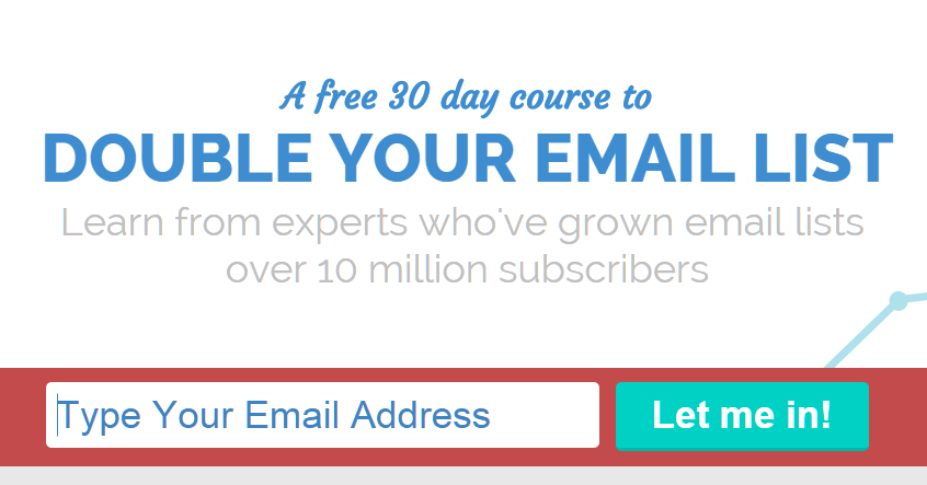
#1. Top of the page
The first place to keep your form is at the very top of the page, usually in the form of a ‘Feature Box’:
Alternatives include a ‘Welcome Mat’…
This will be one of your strongest performing opt-in forms, so make sure it has the following:
- Placed above the fold.
- Benefit-focused copy telling readers why they should sign up.
- Design that catches attention (bold colors, large fonts, strong CTA buttons, etc.)
#2. Bottom of the post
Anyone who makes it all the way to the bottom of your post is like totally into you. These are your hardcore readers. Your super fans.
That’s why bottom-of-the-post opt-ins are awesome. They capture the True Believers and put them into a tidy little database so you can sell them stuff. Gotta love the fangirls.
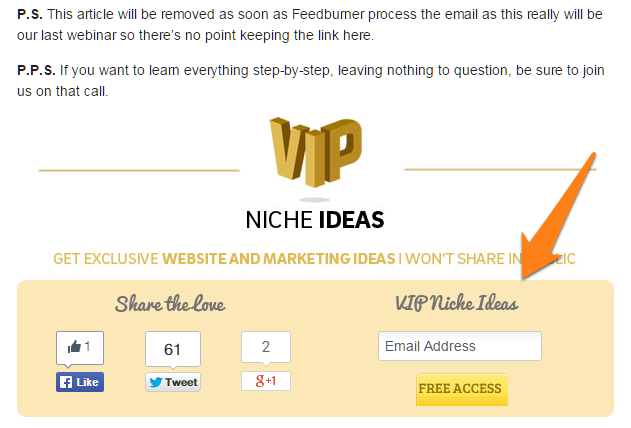
Here’s what makes a good bottom-of-the-post opt-in:
- Emphasize that the reader can get more of the benefit they were searching for when they came upon the post they just finished reading (remember ascension).
- Focus on the benefits they’ll receive when they sign up (and “no” receiving updates from your newsletter isn’t a benefit… not really).
- Reassure readers that it is free to sign-up, that they can unsubscribe anytime, and you won’t ever spam them.
For best results, try placing the form after the social share buttons. If you get a lot of shares, it can work as subtle social proof that your content is popular.
#3. Sidebar
The jury is still out on the effectiveness of sidebars in our mobile-first age. If you do have a sidebar on your blog, however, it’s a good choice to include an opt-in form on it. Why not, right?
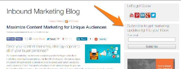
This form should use a design that makes it stand out from other sidebar content. You get extra points for adding a freebie and social proof (such as “join x,xxx other subscribers!”).
#4. Thank You Pages
I’m honestly surprised more marketers aren’t doing this.
Thank You pages are a great way to convert departing readers into subscribers. An even better way to slap a big “THANK YOU FOR ORDERING” surprise gift for the customer that just purchased from you.
And since they’re going to be hitting this opt-in after having just signed-up/downloaded/purchased something, these readers are “warm” and will respond better. A lot better.
Leadpages uses this wonderfully well (They’re geniuses. I love them and their mad scientist ways). Once you sign-up for the trial, you see this page asking you to sign-up for their webinar:
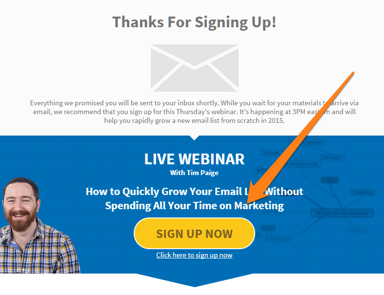
This works on so many levels.
You’ve captured someone in the red hot heat of wanting to sign up for stuff. You’ve already got them running up the ascension ladder. And who the hell in their right mind isn’t going to sign up for something being promoted by a dude with a beard?
No-one that’s who.
#5. Slider box
Another popular location to place the opt-in form is a slider box at the bottom of the page.
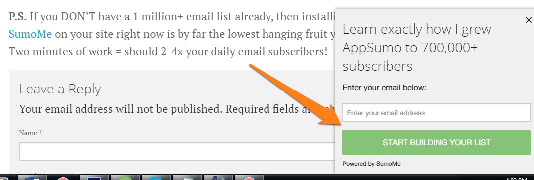
This box pops into view once you scroll to the bottom of the page.
Conversion rates are decent with these for the same reason bottom-of-the-post opt-ins work. They are just a little fancier and make you look Web 3.0 brogrammer cool.
#3. Convince Readers to Subscribe
Once upon a time people were loose with their emails. Irresponsible even. 80% opt-ins were like, “Duh, that’s so easy.”
Nowadays… not so much.
People guard their email addresses closer than their own kids (ask me how I know).
To get access to your readers’ inbox, you have to first convince them that your emails are worth their time. That they get something BETTER than “avoiding spam”.
Here are several ways you can do this:
#1. Create a ‘Why you should subscribe’ post
What’s the easiest way to tell readers why they should subscribe to your content?
Simple: tell them.
I did it here.
Aweber does it better with its “10 Reasons to Sign-up for Free Digital Marketing Tips” page:

A few things stand out on this page:
- The page has a keyword in the title = good SEO.
- The list items are super-short and easy to scan through.
- All 10 reasons focus on benefits – get the right tools, design advice, marketing tips, etc.
- There is an email form right at the top of the page.
#2. Use testimonials or comments from readers
Using testimonials and comments from actual readers can be a great way to demonstrate your content’s value.
TheSkimm does this with a tweet showing support from none other than Oprah:
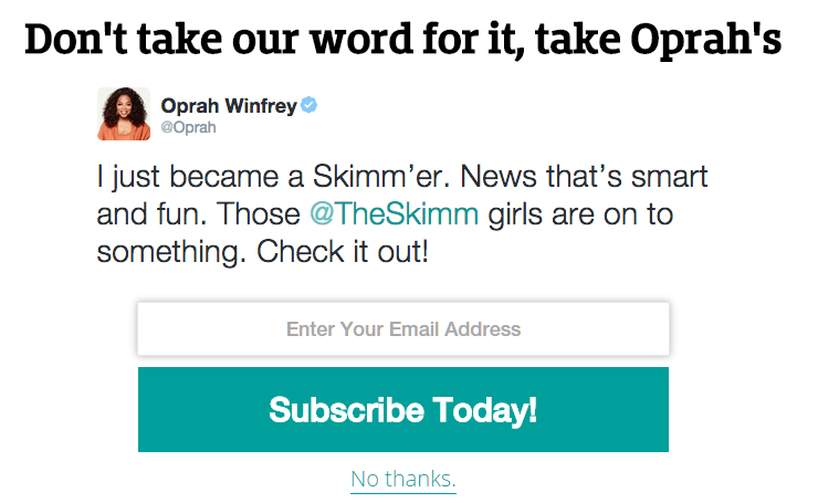
So Clever.
The Hacker Newsletter uses comments from top bloggers and startup founders:

Such comments show that signing up for your email is worth the reader’s time. Think of them as blurbs on the back of a book.
You can use any of the following:
- Facebook comments
- Tweets
- Comments/reviews on other sites
- Blog comments
- Email comments
#3. Show a sample email
Readers have reason to be apprehensive of your email newsletter before it hits their inbox. What if it is too long? Too irrelevant? Too ugly?
Kick their fears in the teeth by showing them exactly what the incoming email will look like. A simple “Here’s what you’ll get” message with a link to an actual sample email from your newsletter works well.
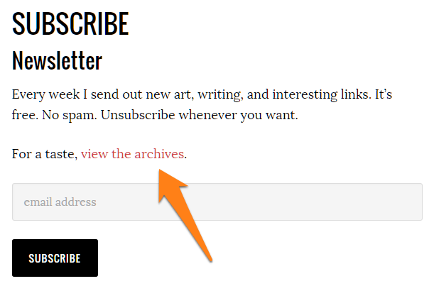
Austin Kleon does this on his newsletter by showing off the newsletter archives:
#4. Use social proof
As Robert Cialdini notes in Influence: The Science of Persuasion, social proof is one of the six pillars of influence. People are hardwired to follow what’s already popular (ever actually watched an episode of those duck call guys?). This is as relevant to high-school cliques as it is to email marketing.
You can get more people to sign-up for your emails by noting the number of people who already subscribe.
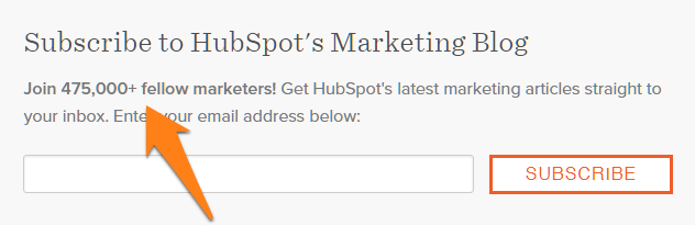
I want 475,000 subscribers…
This tells potential subscribers that there are other folks like them who read your newsletter. It’s a powerful motivator to get them to sign-up.
#5. Tell them your posting schedule
Readers don’t want their inboxes bombarded with the same promotional message 8 times a week. They want to know exactly how often you’ll send them updates.
Buzzfeed does this by telling readers the exact number of emails they’ll get each week.
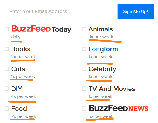
Email readers are easily frightened off.
Surprise them with goodies, not how often you mail.
#4. Make Better Use of Guest Posts
Forget what Matt Cutts has to say; guest posts are the cornerstone of your content marketing strategy.
And yes, there is a right and a wrong way to do guest posts.
The Wrong Way
- Write and publish guest post.
- Include quirky byline.
- Include link back to your homepage, preferably with a keyword.
The Right Way
- Write and publish guest post.
- Include quirky byline.
- Include link back to a landing page made specifically for the blog readers.
For example, if you landed a guest post on Copyblogger, you could slap together a dedicated landing page that welcomed Copyblogger readers:

Here, you could offer them a relevant content offer in exchange for their emails (i.e. the content upgrade tactic I discussed earlier).
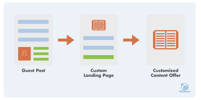
Do this for big blogs and you’ll see conversion rates in the mid double digits.
This tactic works for two reasons:
- Qualified visitors: Anyone who has not only read your guest post but also clicked on your byline link has already shown that he is interested in your offer.
- Value: Think about it – you wrote an awesome post, then you followed that up by giving even more value on the landing page. Your readers are obviously going to love you for it.
You don’t have to do this for all your guest posts, but make sure that you follow it for all the major publications in your niche.
Use these tools to create your landing pages:
- Clickfunnels (What I use)
#5. Use Better Opt-in Forms
The marketer in me cries every time I see an opt-in box like this:
I can’t even begin to tell you all that’s wrong with it:
- The title copy describes an action, not a benefit.
- The design gives no indication of the content. Plus, it’s ugly.
- The CTA belongs in 2005, not 2015.
- It looks like a dirty couch from the early 90’s.
Here’s how you can increase sign-up rates by tweaking your opt-in form:
#1. Use two-click forms
You’ve probably seen opt-in forms like this all over the internet lately:
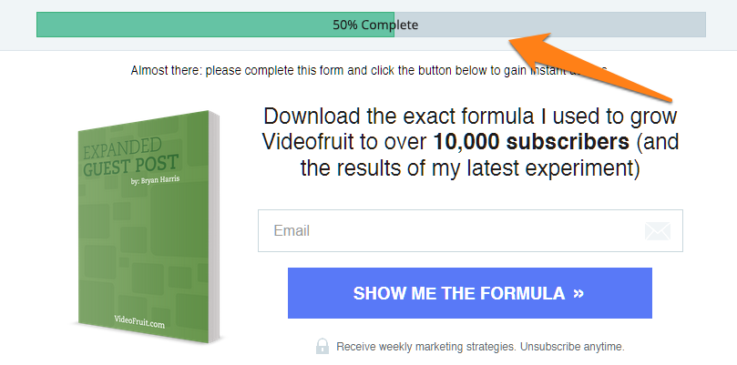
This design goes against conventional wisdom – why would you make it harder to sign-up for your list?
Yet, LeadPages, which pioneered this type of form, increased opt-in rates by 60% with a two-step sign-up process.
There’s a simple reason why this form works: by increasing the number of clicks required to sign-up for your email newsletter, you automatically filter out unqualified subscribers – the ones who are too lazy or unmotivated to click through twice to get your offer.
Think of it this way – for every hurdle you place in your readers path, you increase the quality of incoming leads.
The result? Better conversion rates.
#2. Use value-oriented, benefit-focused copy
Put yourself in your readers’ shoes for a moment. If you landed on a blog and saw two opt-in pop-ups, which one would you choose:
Option A:
Option B:
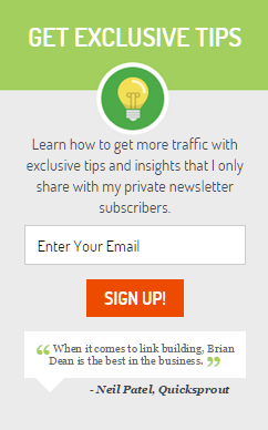
Hands down, most would gravitate towards option B.
Three reasons why:
- The header promises to give away exclusive
- The body copy reaffirms the value, stating that you’ll get tips and insights only shared with private newsletter subscribers.
- There is a testimonial from Neil Patel, one of the most recognizable names in digital marketing.
(In case you were wondering, that’s the sidebar opt-in form from Backlinko).
Using better copy is a whole new topic, but for starters, follow these rules:
- Focus on benefits instead of features (“get more shares” instead of “200 pages of Facebook tips”).
- Emphasize results – preferably, your own (“how I went from 0 to 10,000 visitors in 30 days”).
- Address the reader directly (“you” instead of “they”).
- Give instead of asking (“download the tools I used to grow to 10,000 visitors” “join my newsletter”)
- Promise exclusivity (“get access to tips I only share with my subscribers”).
- Use social proof (“join 20,000 other subscribers”)
#3. Use better CTA
The Call-to-Action (CTA) is an important but overlooked part of the opt-in form. A good CTA does two things:
- It stands out on the page and invites action.
- It promises to deliver value.
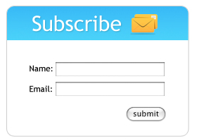
Most marketers use CTAs that do neither of the above. Either the CTA blends in with the background and the rest of the design…
…or it uses generic, descriptive text such as “Subscribe”, “Submit” or “Sign-up”:
Compare this with a CTA that actually performs well:
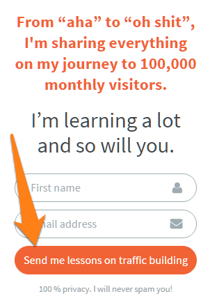
The big difference is that this CTA offers value. It doesn’t say “sign up”; it says “send me lessons on traffic building”.
There are tons of case studies demonstrating that you can increase conversion rates by using value-focused copy on CTAs.
For your own CTAs, do the following:
- Use a bright, bold color that grabs the reader’s attention.
- Use value-oriented copy.
- Use conversion-oriented words such as free, my, etc.
- Avoid transaction-focused words such as order, buy, sign-up. Instead, use benefit-focused words such as get, save, learn, etc.
#6. Create a Resource Hub
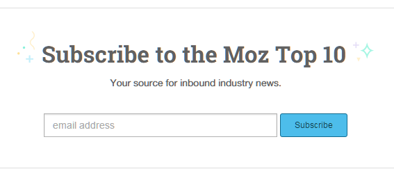
Try this: pop-in at Moz.com and click on the ‘Learn & Connect’ link at the top of the page. Then choose ‘SEO & Search Marketing’.
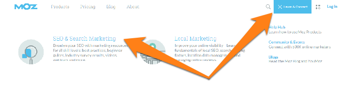
This page is a collection of the best content Moz has to offer.
Scroll down a bit and you will see the Moz email newsletter subscription box:
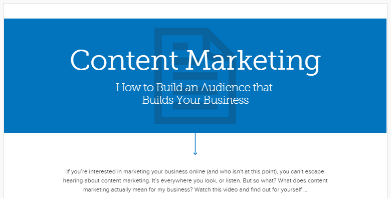
Copyblogger does something similar with its landing pages on Content Marketing, Email Marketing, etc.
Such hub pages of your site’s best content offer tremendous value to your readers. They tell them exactly what to read first. And in the process, they can help you get thousands of new email subscribers.
Creating a resource hub is fairly straightforward. Follow these simple steps:
- Make a list of the top issues in your industry. Is it getting new clients, making sense of social media, or landing leads through LinkedIn?
- Make a list of your best and most popular content that addresses the above issues. Keep in mind that your best content might not be the most popular, and vice-versa. Ensure that you have at least 5 content pieces for each issue.
- Setup a separate page that introduces the issues, and then lists your hand-picked content for it.
- Add an opt-in form at the bottom of the page. Tell readers that if they want to stay updated on the issue at hand, they can sign-up for additional content.
- Daydream ways to spend your money as the subscribers roll-in (optional but my favorite).
7. Use Contests and Giveaways
Contests, giveaways, sweepstakes: you’ve probably dismissed them as cheap marketing gimmicks, but they can be extremely effective when done right.
Take these two guys as an illustrative example:
- Travis Ketchum landed 190,000 new subscribers with a single contest.
- Josh Earl added 200,000 new emails to his list running a giveaway.
The conventional giveaway looks something like this:
- Offer a reward.
- Get people to sign-up for said reward.
- Pick a winner randomly.
While useful, this approach completely negates the viral potential of a good giveaway.
What if instead of the above, you did the following:
- Offer reward.
- Get people to sign-up for said reward.
- Ask them to share the giveaway. For every share, their chances of winning increase.
- Pick a winner randomly.
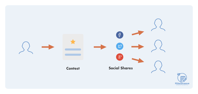
This approach gives participants to share the giveaway. It ties in the chances of winning to the number of referrals/shares. The end result is a hybrid contest/giveaway model where participants have real reason to join.
Here’s how to run an effective giveaway in 2015:
1. Pick a prize people in your industry really want (and no, not iPads). For marketers, it could be an annual subscription to a bunch of marketing tools. For gamers, a collection of new games/consoles. Get creative and don’t use the same old prizes as everyone else.
2. Set-up the giveaways. You can use either io or KingSumo Giveaways.
3. Give participants an incentive to share by increasing their chances of winning for every share they get.
4. Promote giveaway everywhere, including forums, sub-reddits, Quora, and other blogs.
5. Watch the subscribers roll-in.
#8. Create an Email Course
This one is so simple that I wonder why more people aren’t doing it: turn your existing content into an email course.
The conversion rates for such courses beat anything you can get with a plain old eBook.
Do these four things to create your email course:
- Grab your hefty 100-page eBook. Trim away all but the most actionable content.
- Turn each chapter into an email-long lesson.
- Create at least 6-10 such lessons.
- Offer all lessons as an email-only course.
Suddenly, that lengthy, intimidating eBook that sounded like everything else on the market is now a breezy 10,000 word email course (you’re welcome).
Creating email courses is exactly how people like David Kadavy, Noah Kagan, and Brennan Dunn grew their email lists to hundreds of thousands of subscribers.
Email courses work better than eBooks/guides for four reasons:
- Reduced friction: Giving away their email address becomes an automatic choice for your readers. After all, it’s an email course; the only way they can receive it is if they give up their email address.
- Regular reminders: Instead of downloading the eBook and forgetting about it a week later, readers get a weekly reminder that you and your course exists, right in the preferred digital real estate – the inbox.
- Higher engagement: Readers are more likely to go through a course that is spread out in short, digestible lessons over several weeks, than one that is available only as a lengthy eBook.
- Better for marketing: Readers (and spam filters) get used to seeing your name in their inbox. It makes any future marketing messages you send them less abrupt or alarming.
You can use any autoresponder to create an email course, but for simple automation, tools like Drip work really well.
#9. Use Two-Button Pop ups
You’ve probably seen such pop-ups on your favorite blogs of late:
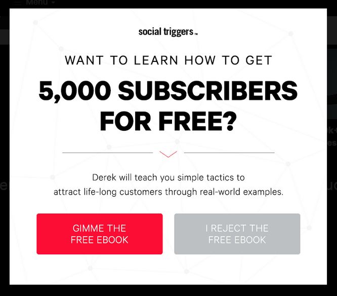
These choice based, two-button pop-ups work phenomenally well.
Two reasons why:
- Frame shift: By giving readers a choice, they change the audience’s reference frame. Instead of asking themselves “should I subscribe to this newsletter?”, your audience asks “should I choose yes or no?”.
- Choice illusion: By giving the option to say NO, you make the YES choice more meaningful. It also helps give readers an illusion of control – they can choose to say no to your offer. This makes the option to pick yes a statement of affirmation – a subtle psychological trick that works.
The results are pretty phenomenal. According to Joanna Wiebe of Copyhackers, using a choice-based pop-up increased her email sign-up rate by nearly 5x.

Use these tools to create choice-based pop-ups:
The pop-up creation process itself is self-explanatory, but you should follow these two guidelines:
- Use bold visuals that highlight the Yes
- Frame the Yes choice as a positive (“I want more traffic!”), and the No choice as a negative (“I reject free traffic”).
- Use benefit-focused copy on both choices (“Yes, teach me how to increase my traffic!”)
In The End…
I’m not going to lie: email marketing is hard.
Look around this blog and you’ll see I only use a few of these tactics to get subs.
But here’s the catch…
Just by implementing one or two of these consistently over time I’ve been able to build an email list supports a mid 6 figure copywriting business no problem. It doesn’t take much to turn emails into cash. Takes even less to start getting more emails starting right now.
The 9 tactics listed above will go a long way towards increasing your subscriber count.
Choose two and get to work implementing them right now.